* PROJECT / Aquadra/ A
Aquadra
Three physical states of one element, water, condensed to represent the excellence of an industry. With the creation of the Aquadra brand, crafted plumbing becomes tangible.
* Naming / Aquadra/ B
A brilliant naming, for a company that has just been founded but already has great character.
A brilliant naming, for a company that has just been founded but already has great character. As a result of accurate research, the name Aquadra effectively represents the identity of a company that offers hydraulic solutions with a pragmatic, efficient and optimised approach.
It was born from the union of "Aqua", a Latin root indicating the industry of reference, and "drain", a strong-sounding suffix evoking the flow of water.
With the payoff 'Frame the flow', the naming acquires tone and consistency. For a company that aims to be a reference in Switzerland, but is already looking at the international market.
In the trade mark, vision and corporate purpose merge, creating an elegant, decisive and rebellious representation.
The refinement of the font was necessary to convey all the rebellious and innovative character of a company whose ambition is to connect competence, beauty and professionalism.
The logotype, which has the three A's of the name as its starting point, tells of a company that guarantees excellent service, in whatever form this may take.
* Visual Identitty / Aquadra/ c
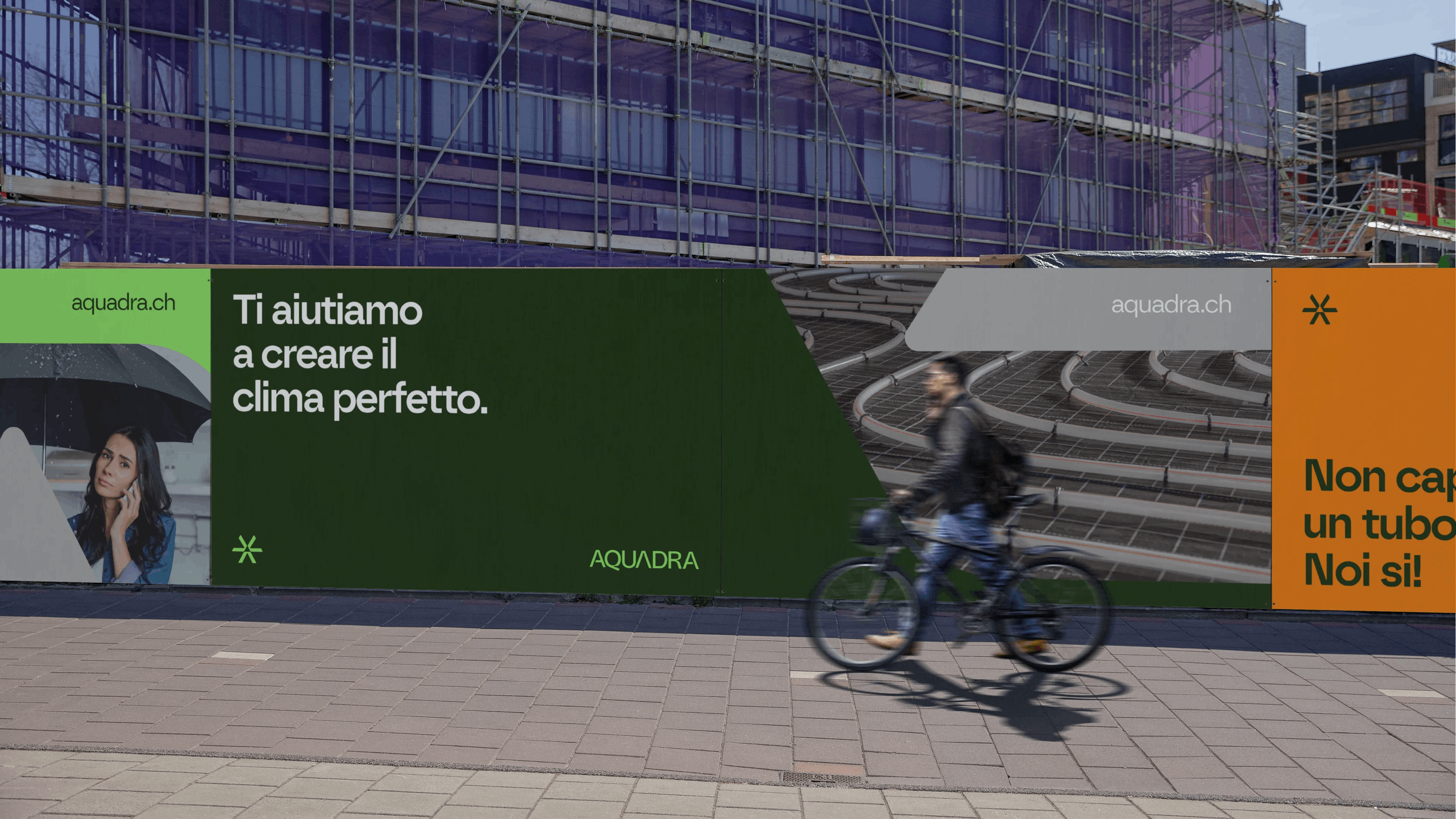
Aquadra's visual identity is like water: fluid and iridescent but always the same.
The logotype's macros, combined with an innovative and bold colour palette, make Aquadra's visual identity a unique and distinctive feature that fits all communication formats with confidence.
Decisive, fresh, and innovative. A strong identity, for a company that aspires to success.

* Social Media / Aquadra/ D
On social media, the identity is vibrant, with a freshness that can be appreciated even in dynamic and modern formats such as digital.
From posts, to carousels, to stories, Aquadra's identity never loses its impact and relevance compared to traditional media, guaranteeing continuity and consistency with the offline context, positioning the company as a true communication reference for the entire plumbing industry.


 Did we hit the mark?

