* PROJECT / CITY POP/ A
Citypop
When creativity meets innovation, the result can be surprising. With City Pop, the innovation in the living concept that puts people at the centre is at the door!
* Visual Identity / City Pop/ B
A revolutionary micro-living concept needs a brand that can properly represent it.
City Pop's visual identity, as dynamic and flexible as the international community it addresses, immediately visualises the experience and quality of the service.
City Pop offers beautifully designed flats in strategic locations in the main European cities, which can be easily rented through the app as a hotel room.
The geotag symbol is combined with the brand promise "You are in the centre".
From their synthesis, was born the graphic sign with the Y in the centre of the logotype.
Cos at the centre of the City Pop revolution are people and their needs.
The visual impact of the logo is strong and communicates the brand's mission: satisfy all people's needs by offering flats with all comforts in the centre of Europe's largest cities.
The visual identity is modern and dynamic, and the shapes derived from the logotype ensure continuity of the brand promise from the real to the digital world.
* Social Media / City Pop/ C
The social profiles show a great visual impact, the adaptability of the graphic layout on social media is emphasised, with a vibrance that gives the formats a unique touch.

* UX/UI / City Pop/ D
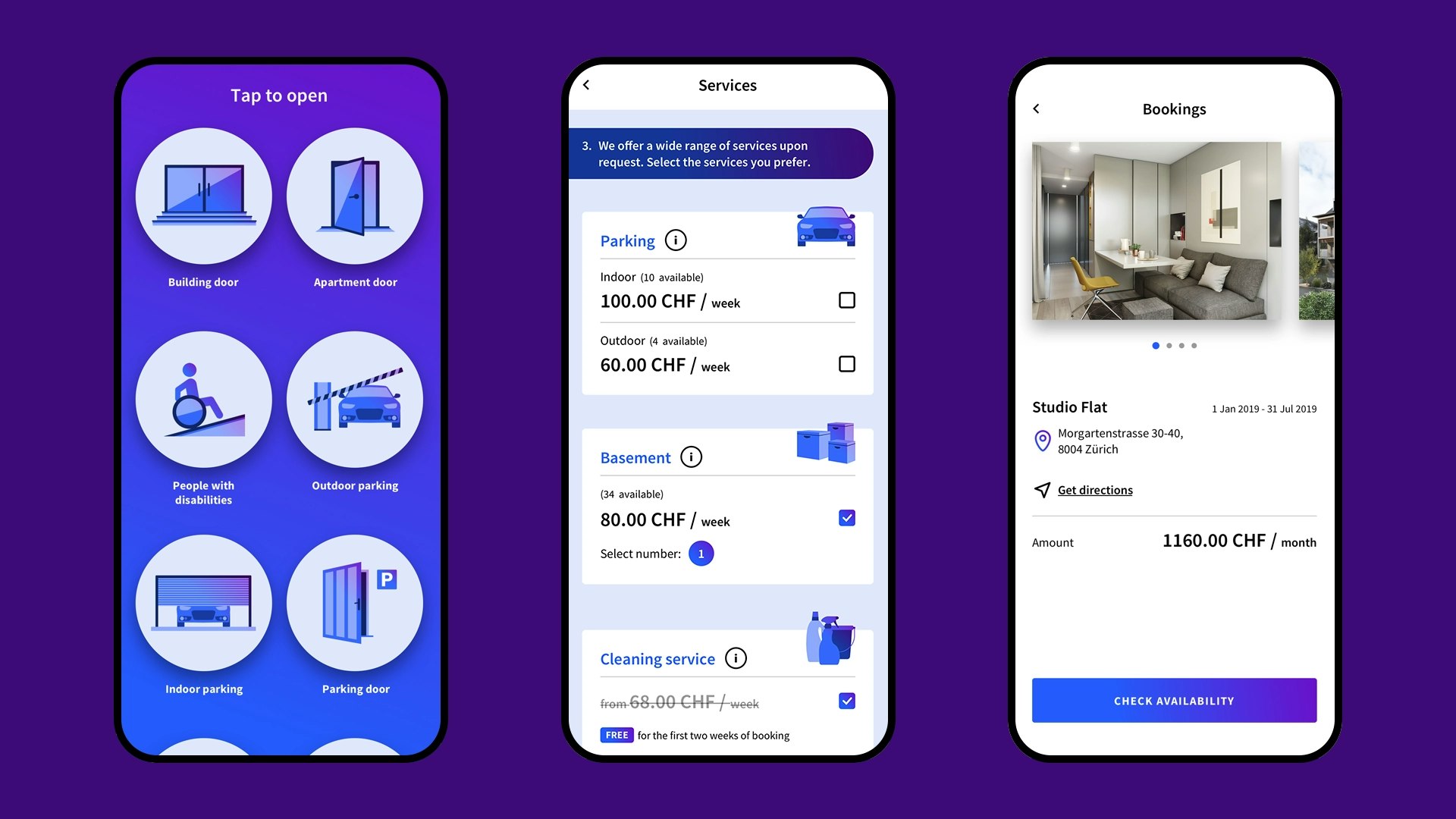
The app is just a taste of the modernity of the service offered by City Pop. With a cleverly designed UI, every step becomes clear and simple, making it as easy as possible to use the service at all stages, from booking to check out.
It doesn't matter which city you are in. With City Pop we have put people at the centre, with the turnkey future.


 Did we hit the mark?

