* Project / Axure/ A
Axure
Ensuring a successful positioning to stand out in the Swiss and international market? With Axure, we did it!
* Naming / Axure/ B
Positioning in a saturated market such as the insurance brokerage is not simple.
However, we, being brave creatives, have taken up the challenge and come up with a naming and visual identity that can make its way in the Swiss market and beyond.
With the Axure naming, we were able to combine the mission and purpose of the entire insurance industry in five letters, coupling the term for the operational sector with the promise of future stability.
The payoff associated with the brand, 'the future assured', strengthens and reiterates the brand promise, inspiring trust and reliability.
* Visual Identity / Axure/ C
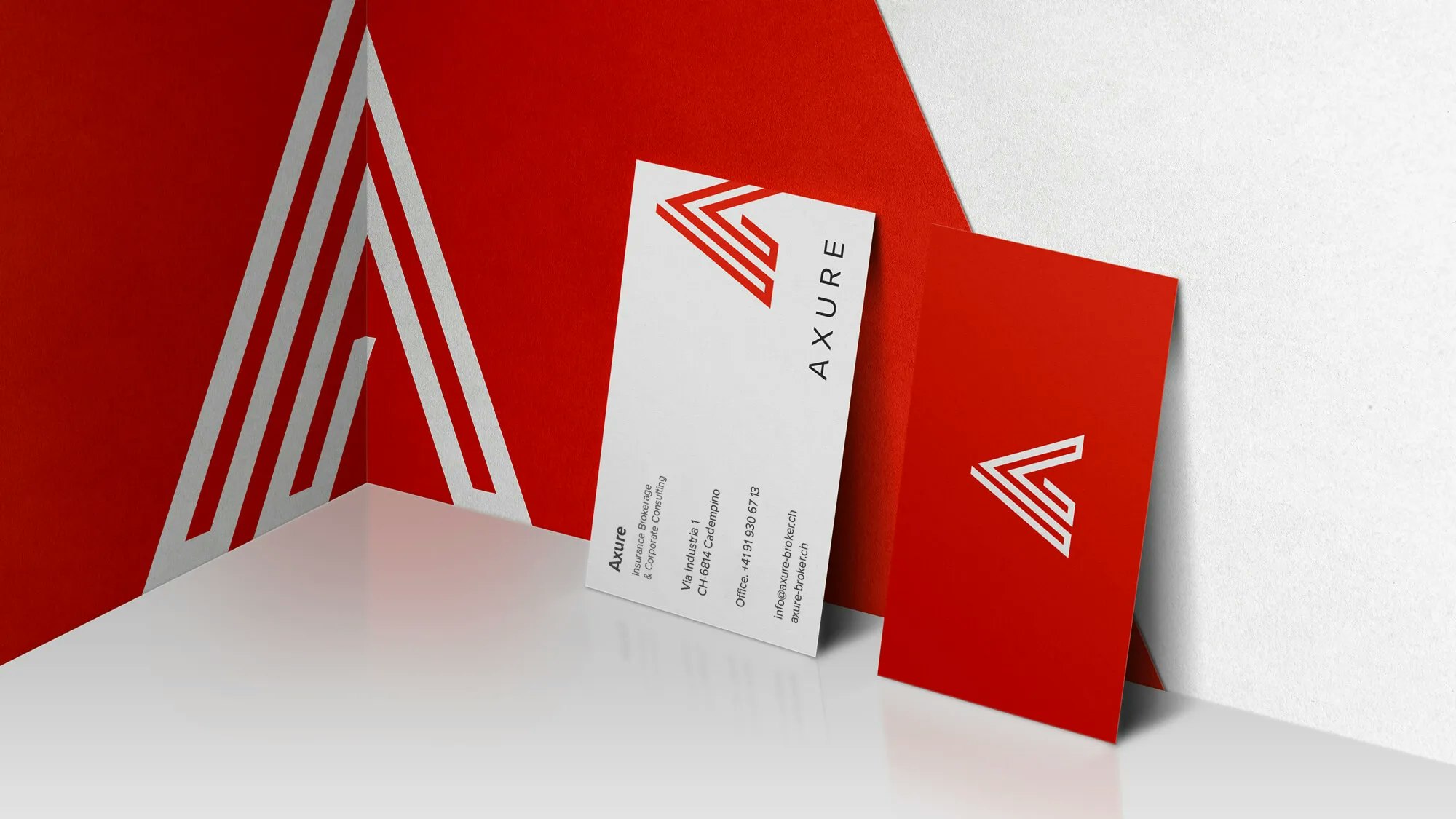
The logotype, characterised by clean, simple lines, reflects the solidity and standing of a company with a global presence that offers products tailored to the customer, with an uncompromising consulting experience.

* Web / Axure/ D
The visual identity, modern and elegant, adapts to all communication formats, and on the site is enhanced by a clear and intuitive UI, aligned with the company's mission: to simplify access to insurance products, to protect the future of its customers.


 Did we hit the mark?

